Fast forward to today: close to 40% of survey responses are being completed on a mobile device, and trending ever-upward. It’s no longer adequate to be mobile-compatible; we need to be mobile-first (approaching the Datagame respondent experience with smartphones at top-of-mind).
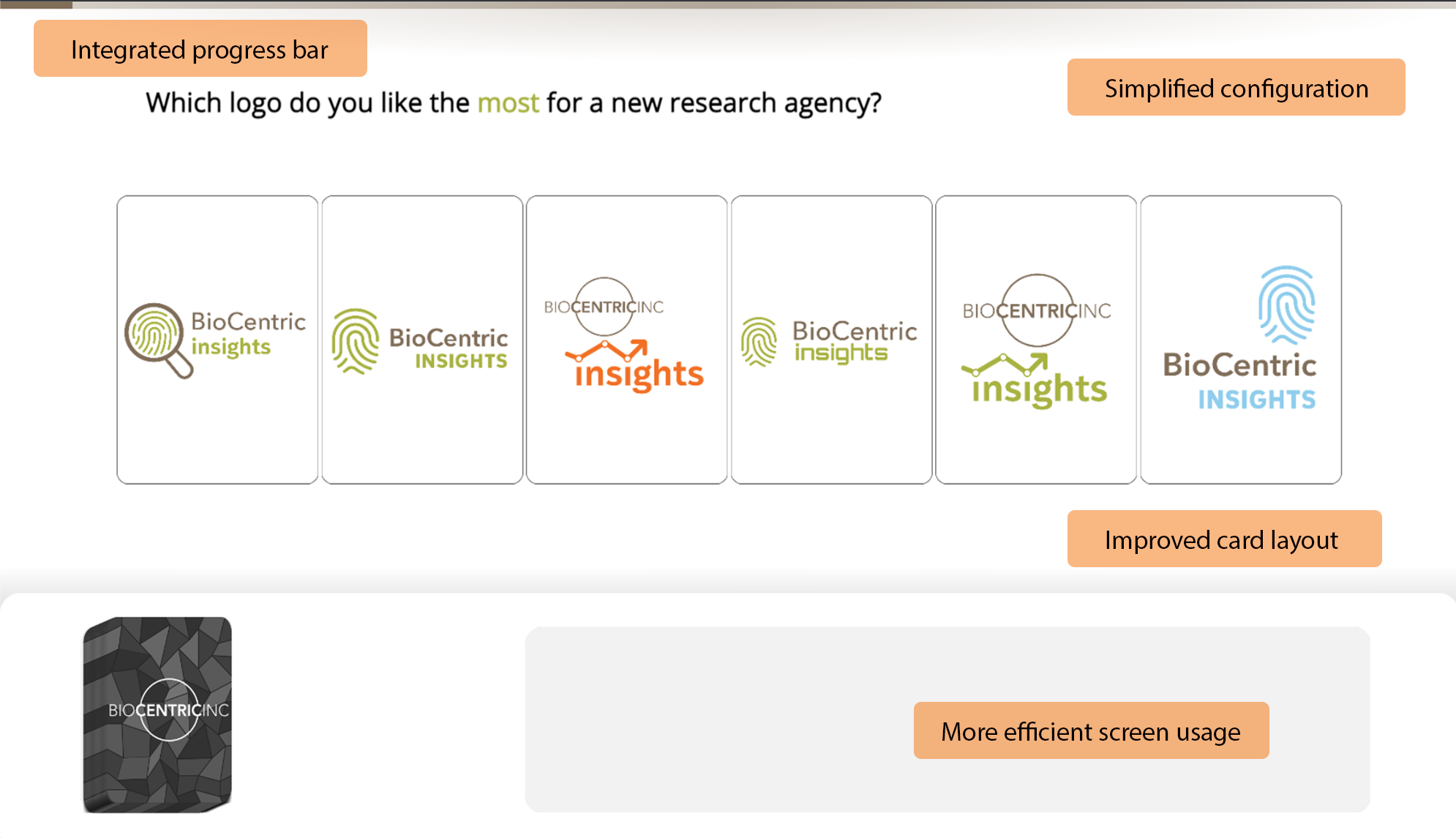
And so, after a significant rethink, we’ve re-released our three most popular modules (Rankifier, QuickRank, and Swiper) in a new mobile-first layout that reduces unnecessary screen clutter and makes better use of a phone’s limited screen real estate. Cards and buttons are larger, text is easier to read, CPU load on mobile devices is significantly lower, and color and screen formatting have been simplified.
The new designs aren’t without some tradeoffs, however. The original Datagame modules are highly configurable and allow users to combine essentially any set of images and colors they like when designing their game interface. This made it possible to override (or at least subdue) many aspects of the user interface but at the expense of requiring you to develop graphical assets and configure quite a few settings. It lengthened the path for creating and configuring a Datagame and having it ready for publishing.
For now, we have left both the original and new mobile-first game clients available. If you need to completely reskin the experience and can generate the various graphic assets required, you can continue using the original game clients (and configurators) with no change in functionality. However, if your use case allows for the more streamlined (and visually cohesive) new game clients, we encourage using them on new projects.
Before and After: Rankifier 2
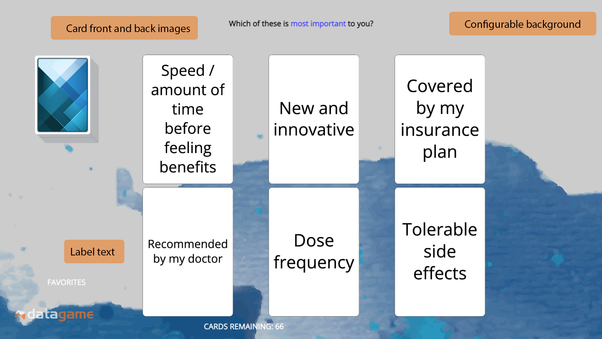
The original Rankifier module is a gamified MaxDiff exercise, inviting users to make rapid selections from dealt hands of cards to ultimately measure the relative strength or preference of the items in the deck. The original design supports several visual customizations:
- The game background
- The game board (border elements that separate the play space into different components)
- Visuals on the cards
- Font colors on instruction text
- Game board text labels
Original Rankifier user interface and sample configuration options
The greatest challenge for “classic” Rankifier, though, is its dependence on a landscape (horizontal) orientation. When playing a classic Rankifier exercise on a smartphone, users were required to rotate their phones before gameplay could begin.
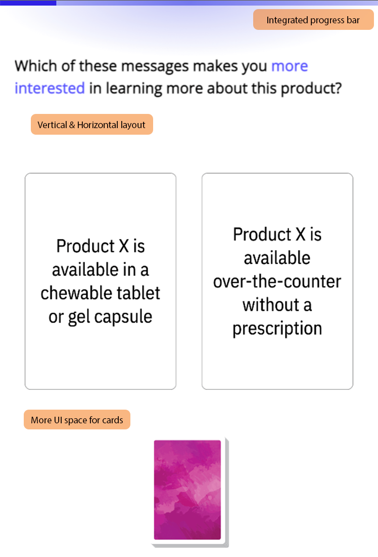
The updated Rankifier 2 client uses a responsive layout, with different arrangements for the playing cards depending on the screen orientation. Neither landscape nor portrait modes suffer any functional restrictions, and both support the same customization options. It’s a much friendlier smartphone experience.
To maintain this consistent experience for all devices and screen orientations, we removed the customization options for the game background and game board; these are now standardized by the platform. We’ve also made it easier to specify standard text color formatting situations, such as defining a “positive” and a “negative” color for use in communicating player instructions.
New Rankifier user interface with responsive mobile-first layout
Before and After: QuickRank
The updated QuickRank 2 client makes more effort to emphasize this second dimension. It’s still possible to configure a QuickRank 2 game without a rating scale question, but the UI is well-defined to make this a fast process for users. We encourage you to take advantage of it in future projects.
Like Rankifier, QuickRank 2 was originally “locked” to a horizontal screen layout. Mobile users holding their phones vertically would be prompted to rotate their device before the game would play. That requirement no longer exists in the QuickRank 2 design. We’ve maintained most of the visual customization options previously available, except for full-screen background images:
- Card front and back images
- Customizable question text on cards and instructions
- Font colors
- Likert scale anchors
Original Rankifier user interface and sample configuration options
Before and After: Swiper
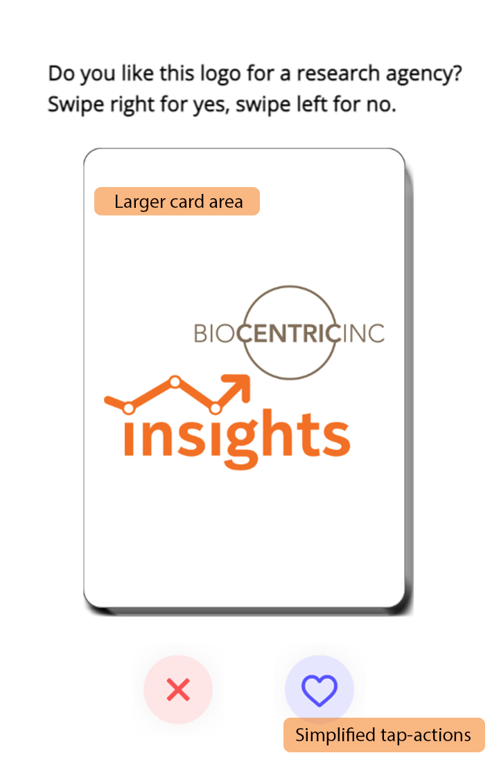
The original Swiper game was already implemented in a responsive design, with different interaction mechanics and user interface controls depending on screen orientation. Only minimal changes were required to bring Swiper into alignment with the other new game clients:
- We removed customizable backgrounds from Swiper, as none of the other game types now support this customization
- We removed the Social Sharing feature (which optionally allowed game results to be published to the users’ own social media feeds)
- We replaced Swiper’s unique post-game feedback screen with a visual design consistent with the new post-game feedback screens on Rankifier and QuickRank
- The positive/negative affinity icons, which were previously selectable, have been consolidated into the standard UI and are now not changeable
In exchange for these pruned features, the updated Swiper experience integrates much more cleanly into a multi-Datagame user flow. Swiper also now benefits from consistent pre-game and post-game user screens.
Pre-Game Welcome Page
One of the lesser-used components of the original Datagame modules was its built-in “Pre-Game Instructions” screen. When activated, this element would display some lightly formatted text in a pop-up dialog box prior to the beginning of gameplay. The intention was to make it easier to use Datagame as a standalone tool and reduce the temptation to configure informational screens within a survey tool, but in practice this feature only received limited usage.
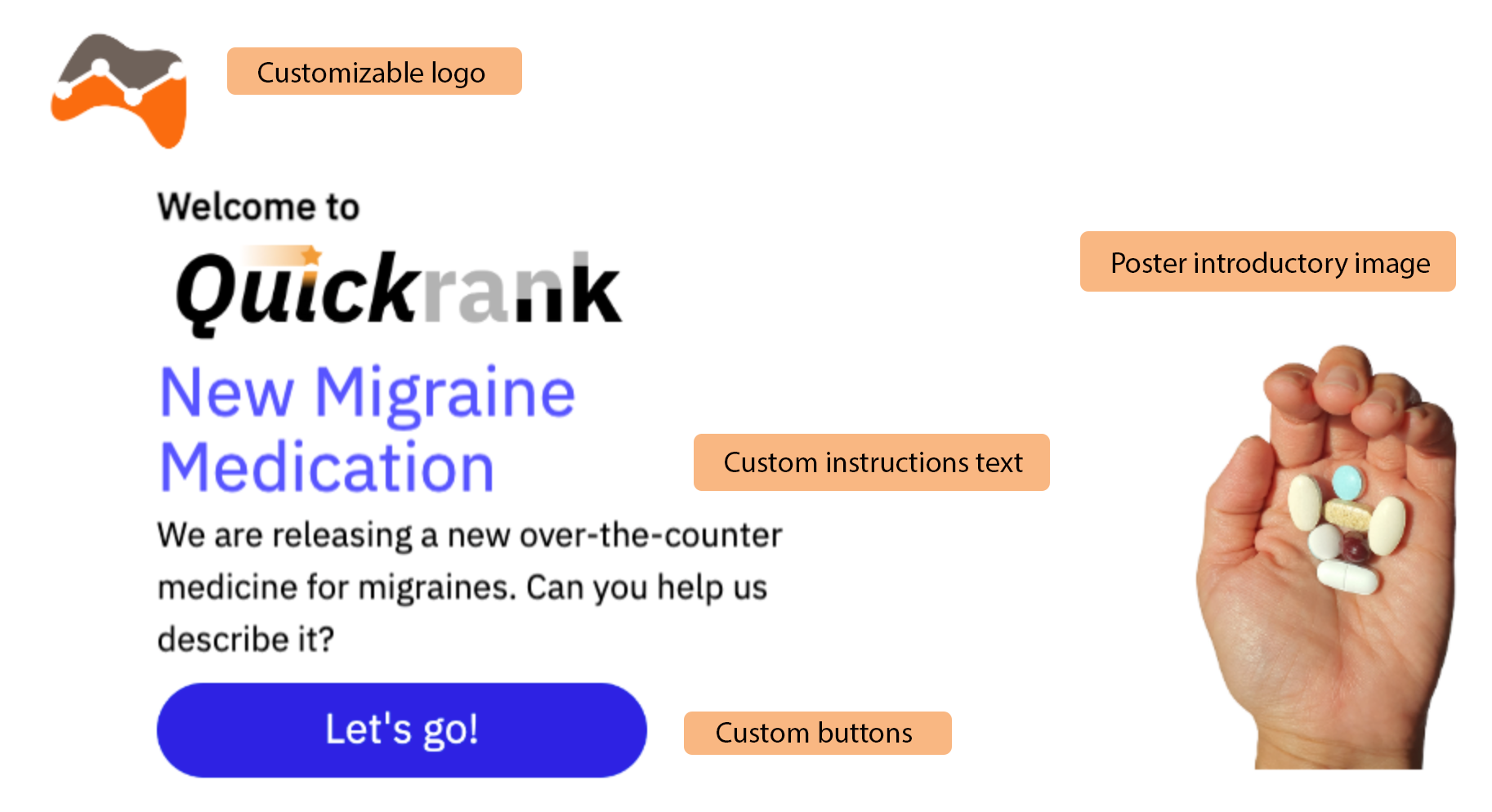
All Version 2 game clients include a new, optional Welcome Page with a bit more content variability and easier configuration. In addition to the ability to provide some introductory text, logo images and “poster images” (full-height image banners) can be added in a manner that maintains Datagame’s consistent look and feel throughout the gameplay. All these elements are responsive; there is no new integration code required to include a Welcome Page as part of a game.
Optional Post-Game Qualitative Data
Another frequent client request has been the ability to collect some open-ended feedback as part of a Datagame exercise. We’ve always been interested in the qualitative research opportunities for Datagame and gamification, but it’s challenging to find the right moments to offer a qualitative prompt. Those moments are often very contextual and benefit greatly from the guiding hand of a moderator or interviewer.
However, many projects would benefit from an open-ended question immediately after completing a Datagame exercise. The Version 2 modules provide exactly this capability, combined with an additional rating scale question to capture both freeform text and a discrete data point. The post-game Exit Form is optional but, when combined with a Welcome Page, can turn a Datagame exercise into a self-contained rapid research tool.
Try the Version 2 Datagame Modules
If you’re a current Datagame user, there’s really no reason not to upgrade to the newer modules for future projects. They’re drop-in compatible from a data collection perspective (although there isn’t currently a mechanism for converting an existing game configuration into the new designs). If you evaluated Datagame in the past or rotate your subscription on and off depending on your current project needs, now is a great time to experiment again.

